Financial Analytics Platform Redesign 

UX/UI Design | Prototyping | Developer Handoff | Research

Client: ARGA Investment Management is an independent asset management firm with a stringent investment approach; with unique research, analysis, and management methods, their teams rely on both public data and proprietary intelligence; ARGA has been building a database combining both data sets to create a financial analysis platform

Problem: They found team members were resistant to utilizing the powerful analytics potential, citing clunky and unintuitive functions

Ask: Redesign the platform to increase usage as well as update the overall look and feel

Scope: Solo project / 30 days / Desktop application redesign

Solution: Redesigned core workflows, especially filtering to create lists of companies and to search for documents; also modernized interface with white background and economically-utilized colors.

Status: In development


IDentifying highest impact workflows to redesign: interviews & Heuristic Analysis

Interviews with key stakeholders ensured expectations and goals were established at the onset of the project. 

Interviews with the main users of the platform, focusing on the tasks they need execute and data they need to access, as well as a heuristic analysis of the existing platform revealed the following major pain points and workflows:

Pain points: unnecessarily complex user flow, hard-to follow categorization, outdated designs. 

Workflows: viewing, creating, and editing a list of companies (known as a “universe”), and viewing/searching for documents.

redesigning: Wireframing & prototyping

The users needed to be able to efficiently pull up/edit lists of companies and quickly find/view documents, so I focused on:

-Reducing the number of actions/clicks needed to complete a task.

-Removing unnecessary content/criteria and condensing/grouping related.

-Guiding users through the process with grouped and/or numbered sections.

-Orienting users with clearer and standardized copy.

-Modernizing and cleaning up the overall look and feel with a white background and sparsely-used highlight colors.    

To get a sense for the redesign process, below are three versions of the screen to create a list of companies on the platform: the first image is the original design, the second is a sketched wireframe of the redesign, and the third is the polished redesigned screen.

Original Create Universe

Wireframe of Create Universe

Finalized Redesign of Create Universe

And to get a sense for the navigation and the rest of the redesigned screens, below is the finalized redesign prototype:

validating design decisions: Test, iterate, Repeat

To ensure the designs enabled utilizing the analytics platform easy, I reviewed the key sections with stakeholders and tested all identified workflows with usability tests. After two rounds of iteration with ARGA team members, I presented the designs to stakeholders for a final alignment session before the designs were given the green-light. 

Production (in progress)

I went over the prototype with the developers, ensuring they were onboard with the designs as well as understood how to utilize InVision. I'll be responsible for the successful production of the design so after the pages are complete, I'll be performing quality assurance testing as well as a final round of usability testing with ARGA team members.

Gallery of redesigned workflows: side-by-side comparison with original screens

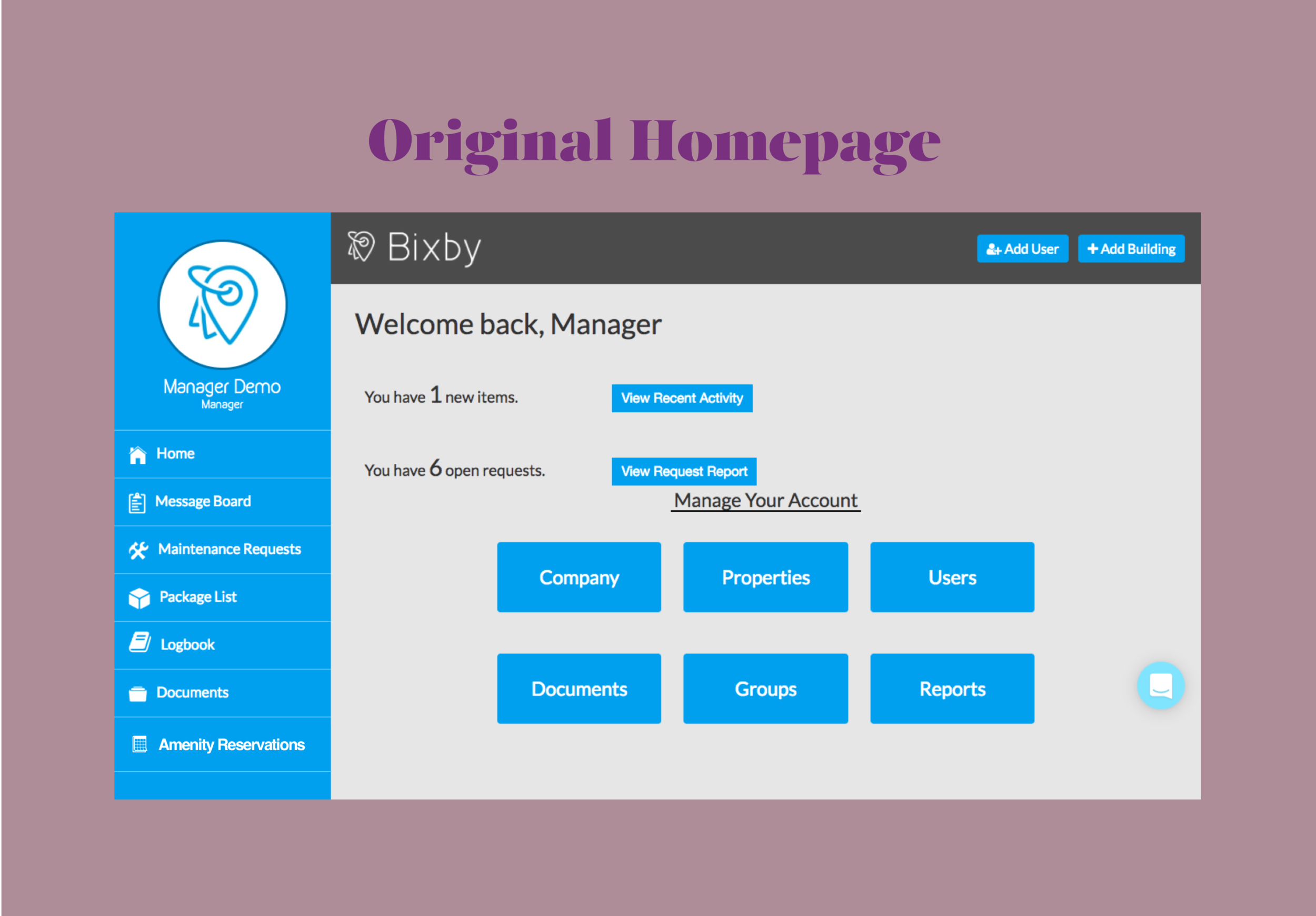
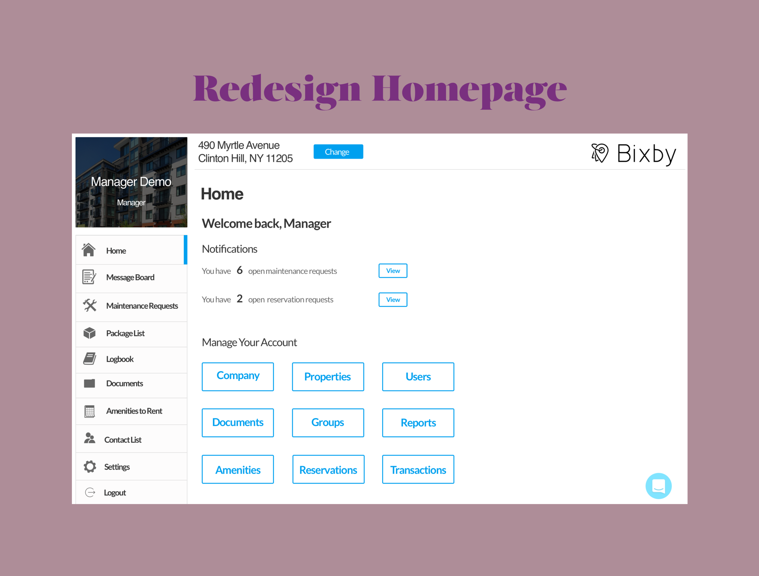
Homepage

Original

Redesign

Searching for a document

Original

Redesign

Creating a list of companies (a "universe")

Original

Redesign


Impact Through Design: Anti-Fake News App (Concept)

Research | Strategy | UX Design | Prototyping

1. The Problem, Scope of Project, & My Role

What was the last article you read on Facebook? Did you doubt some of the claims? 

My team found that while users get most of their news from Facebook, they have little confidence in the legitimacy of the facts and search elsewhere to cross reference the information.

We sought to equip users with confidence in the news from Facebook
Our solution is a news aggregator app called FrontPage that provides fact checking scoresa news organization's political bias, and contextual information.

The Problem:

With the rise of fake news and the prominence of ideological echo chambers within social groups, Facebook's legitimacy as a news source is undermined significantly.

My team wondered how might we ensure Facebook users have confidence in the legitimacy and transparency of the news they’re consuming.

Scope of the Project:

Team of three / 14 days

Mobile App

Wireframed in Sketch / Prototyped in Flinto 

My Role: Researcher, strategist, and designer


2. Research & Analysis

To begin to solve the problem of increasing confidence in the news on Facebook, we set out to understand exactly how news is currently consumed on social media.

We spoke with ten users. Below is a sample of questions we asked: 

  • How many times did you read the news last week? What sources of news did you read last week?
  • What thoughts about the article, the content, or the author do you have when you read an article?
  • What is your perception of the news articles that appear on your social media feed?
  • When you read news on social media sites, what, if anything, do you appreciate about the experience? What, if anything, do you think is missing about the experience?

Our hypothesis and assumptions were that users:

  • Want to know if statements are true
  • Want transparency in bias and opinions
  • Assume articles are mostly clickbait
  • Check reputable sources to compare information reported in articles on Facebook
  • Have follow-up questions to articles and will search on Google for more information


To understand users' expectations when reading news on social media, I put together an analysis of features four competitor sites (at the intersection of news and social media) utilized: 

A snapshot of the features analyzed

Key insights from our research were that users:

  • Want legitimate news sources and have go-to sources
  • Want to research information in articles
  • Want alternative viewpoints on a topic covered
  • Must have transparency in how much an article is opinion and fact
  • Want to be on top of current events / in the know of what everyone finds important
  • Valued ranked comments on sites such as Imgur and Reddit
  • Discount articles on Facebook due to perceived lack of credibility and transparency

4. Ideation & Solution

We synthesized our research findings and created two personas who we focused on for our solution:

Primary Persona: Katheryn

Secondary Persona: Cameron

I mapped out a common experience reading news on Facebook from our primary persona's perspective:

A clear negative trend: Bumps along the way include finding clickbait headlines, inflammatory comments, and heavily biased / opinionated articles (that are masquerading as facts)

Our Solution:

Our solution is a native iOS news aggregator app called FrontPage which is similar to Facebook's messenger app in that it can be accessed from the Facebook app, but is a standalone product.

To address the lack of legitimacy, transparency, and contextual information, and the need for relevancy, the app's key features are:

  • A top news feed and social news feed
  • User-submitted annotations
  • Facebook integration
  • Fact-checking scores
  • Media bias indicators for news organizations
  • Access to contextual information

These are some of features that best addressed the problems and needs revealed during our research phase

Ideation:

After a couple sessions of collaborative ideation (design studio), our team came up with a one-column, minimal feed design similar to social media platforms such as Facebook as well as reputable news sources such as the New York Times and the Wall Street Journal.

We then divided up the design work; I took on designing the article and its contextual information.

Initial Mid-Fidelity Wireframes:

News Feed:

My teammate took on the feed design. The feed is divided into a "Top News" and "Social Feed"; "Top News" is the most recent news published whereas the "Social Feed" contains articles shared by Facebook friends. Having these two feeds ensures users have both types of relevancy.

Each article you'll see has a fact-o-meter indicator, news organization bias indicator, and user-submitted usefulness rating to provide transparency on the organization and its article, as well as yet another layer of relevancy.

Article with carousel of contextual information:

From the news feed, users will find similar indicators for the article as well as be able to click on the text to lookup contextual information and articles form other news sources on the same topic

The carousel pops up when a text is clicked on, similar to the Kindle's carousel

The highlighted text is user-submitted notes / commentary

We prototyped our designs in Flinto and set out and test our first iteration. 

Strong results: There was some general confusion as to how the usefulness and truthfulness ratings were generated

Since there weren't major concerns regarding the functionality, some adjustments we focused on when moving to high fidelity were to:

  • Clean up the indicators on the news feed to clarify "truthfulness" and the bias of the news organization
  • Ensure design was clean and maintained some of Facebook's look and feel
  • Provide more information on how the usefulness and truthfulness ratings are generated
  • Adhere more closely to iOS standards (since the solution is an iOS app)

High-Fidelity Wireframes:

News Feed:

I re-designed the bias and truth indicators by adding labels, changing the bias scale to circles from a rectangle with color gradients, as well as making them smaller overall

Hamburger menu was changed to a bottom tab bar per iOS standards

Facebook-related colors and format for the search field were added to add more branding

Article:

       I carried over the new indicators from the news feed               and removed images to clean up the article

Carousel replaced with an overlay for the contextual information:

My focus for this feature was to match current iOS experiences and clean up the interface

We again prototyped in Flinto, merged, and tested our next iteration. 

Overall, functionality remained high and there was better understanding of the indicators for the news sources and articles.

Next Steps:

Were we to go through another round of iteration and testing, some of the key areas to focus on would be:

  • Including news organization under bias indicator
  • Further prioritization of features to decrease API's utilized
  • The value of user-submitted highlighting / annotations in articles
  • Further clarification of how truthfulness is calculated
  • Testing value proposition of a "usefulness" rating

Conclusion: 

The need for FrontPage is evident in that those who read news on Facebook want more transparency; similarly, Facebook has openly made this a priority and is actively seeking a solution. Jumping off of that, FrontPage is part of the movement towards greater media literacy and responsibility. This kept our team supercharged throughout the project and I personally hope to be a catalyst in these type of impactful products being developed. 


Please reach out with feedback or comments overall! I'm eager to discuss.


Next: Bringing apartment living into the modern age with Bixby's amenity booking featured 


Enterprise Software Design: Bixby Amenity Feature Integration

Research | Information Architecture | UX/UI Design | Prototyping | Production

madewithmagicmirror no overlay v3.png

Bixby

Bixby is a real-estate technology platform connecting building managers and residents.

They found that managers were manually processing reservation requests for communal spaces (eg. roof deck). My team of three UX designers was tasked to streamline the booking experience.

I led research and design for the manager’s feature which included interviewing, designing, and prototyping.

In addition, for developer handoff, I provided user stories, user flows, annotated wireframes, Sketch and Zeplin files, and the high-fidelity prototype (see “Manager’s Desktop Prototype”).

This feature is now live.


Client: Bixby is a platform connecting residents and building managers, bringing apartment living into the modern age

Problem: Building staff manually manages reservations and payments for amenities (eg. a game room, grill, or roof deck) which is inefficient and costly, especially when checks/cash are misplaced

Ask: To streamline reserving and managing amenities for both tenants and managers of luxury apartments

My Role: Lead research, strategist, and designer for the manager’s feature; Lead research and strategist for the tenant’s feature

Scope: Team of three / 20 Days / Mobile app and desktop website feature

Solution: An “Amenities” feature integrated into the current platform where managers can: manage listed amenities, view and take action on all reservations, as well as charge tenants

Status: Deployed 


Research: User Interviews & competitive analysis

I determined the following the methodologies:

  • User interviews of building managers with amenities available to rent

  • User interviews of residents of buildings with amenities available to rent

  • Competitive matrix to understand Bixby's competitive landscape

  • Feature analysis of competitive / comparative products

We interviewed five building managers and five residents of luxury apartments.

Select questions for the managers: 

  • What are you responsible for? What are your everyday tasks?

  • Do you rent out those spaces? What’s the process for renting those spaces? (if paid, how do you accept payment)? Are there limitations for reserving?

  • How do you manage and keep track the amenities?

Select questions for the residents: 

  • What public/communal spaces do you have in your building?

  • When was the last time you used a space and what did you use it for?

  • Tell me about the process from finding to booking the space.

User Interview Synthesis:

Building managers:

  • Are very busy and need to eliminate manual work

  • Need to be able to create and edit amenity listings

  • Need payments easily tracked

  • Want to avoid recurring questions such as availability of amenities

  • Wants to easily notify residents about an amenity's availability

Residents:

  • Are young professionals

  • Use other booking platforms like OpenTable and expect certain standards

  • Are high-paying residents and expect good service

  • Prefer to talk with the doorman because of the immediacy

  • Need more transparency in the process if it must be online

  • Want to know an amenity's availability

Competitive Matrix:

To understand Bixby's competitive landscape, I mind-mapped Bixby's characteristics and narrowed it down to Bixby being specific to a building ("Building Specific") and a product for both the resident and building manager ("Multi Sided Marketplace"). This set up the following competitive matrix and Breather, AirBnB, WeWork, and BuildingLink as key competitors:  

Competitive matrix with Bixby highlighted to indicate clearly where it lives against the competitive and comparative products.

Feature Analysis:

After I determined the Bixby's competitors and target users, I analyzed the best practices and design solutions currently for reserving spaces and managing those reservations, I put together an analysis of the features four competitive and comparative reservation sites utilized:

A snapshot of features pulled and compared across the four competitive and comparative booking products


design Solution Ideation

After facilitating an ideation session to get out all possible features, we utilized the MoSCoW method to prioritize which features to include in the designs. 

We concluded the following features best address building managers' pain points and needs and must be highlighted in the design:

Pain Point/Need -> Feature

  • Eliminate manual work -> Automated booking requests, auto-populated calendar

  • Create and edit listings -> Create new and edit functions for amenities listings

  • Easily receive, track, and extract funds -> Transactions page for all reservations, extract funds options for completed reservations

  • See and confirm reservation requests -> Confirm/decline function on unconfirmed reservations page, list and calendar views for reservations

Our team then went through several rounds of collaborative ideation sessions (design studio) for the feature designs.

We came out with wireframes from each use case identified.

manager_design_studio.JPG

Design Studio

Snapshot of our design studio session


design, PROTOTYPE, TEST (REPEAT)

We completed two rounds of testing refining navigation and table designs.

Below is an example of one of the main screen flows for the manager:

Confirm Reservation Flow Title 2x.png

In addition to interactions, the client requested UI upgrades aimed to make the design modern and cleaner:

Title.png

Developer hand-off & Production

Wireframes, user flows, assets, and an InVision prototype were provided to the client and the design is now fully deployed.

Concluding thoughts

Designing enterprise software is energizing in that there are many components and vastly complex processes for which must be accounted. 

Please reach out with feedback or comments!


Next: Impact through design, instilling trust and confidence in readers in the age of fake news 

Research | Remote Usability Testing | Strategy

National Geographic is a internationally-renowned digital cable, publication, and research company. With many incredible facets, NatGeo sought to redesign their homepage to educate users and encourage them to explore what they have to offer. Before launching the new design, NatGeo brought our team of two in to assess:

-Engagement with the homepage.

-Ease of use via overall layout, UI, graphics, and copy. 

Interviews

Our team of two researchers recruited 12 users (a mix of prospective and current NatGeo customers) and conducted remote one-on-one usability tests with a desktop and mobile prototype.

Findings & recommendations

Combining qualitative and quantitative data collection from test sessions, we concluded:

-The homepage was positively received and perceived as very usable.

-The NatGeo brand is so powerful discoverability of new services was lower than anticipated.

Our team recommended:

-Clarifying copy to increase transparency for lesser-known/new services.

Research | Strategy

General Assembly is a highly-regarded technology school founded in 2011. A core curriculum developed by a team of specialists is intended to be taught on all its 20 campuses; instructors have the freedom to alter material as they see fit to share specific areas of expertise and examples.

My team of four researchers were brought on by GA to understand an apparent disconnect between the global team and local instructors in the creation, delivery, and alterations of the course material.